Case Study:
Hiker Help
(2019)

An app that helps hikers find trails,
prepare and stay safe as they hike.
Summary
A passion project inspired by information troubles I experienced during my thru-hike of the Pacific Crest Trail. At the time of this study, there was no standalone location-based hiking app that combined all of the information needed to feel safe and prepared for, and during, your hike. To gather all of the pertinent information for any given hike, a hiker would need to have several apps on their phone, which is not ideal when battery power and signal are scarce. To solve this issue I utilized design thinking methodologies to create a lean, efficient, location-based phone app that combines all of the information a hiker needs on prep, safety, navigation, resources and rescue for their hike.
My role:
Creator, UX Designer, UX Researcher, Content Creator
Duration:
4 mos (2019)
Users:
(Not in production - passion project)
THE PROCESS
EMPATHIZE
DEFINE
IDEATE
PROTOTYPE
TEST
ITERATE
Empathize
RESEARCH
Initial research goals:
-
Understand the user and their app usage behaviors
-
Identify the most desired features
-
Determine the most relevant, preferred interface
I gathered information on apps which were closely related to my concept. I joined Facebook groups and online hiking forums, studied hiker blogs, gear lists, comparable books, available user data such as user demographics and trail use statistics. I read through hundreds of user reviews of similar apps taking notes on pain points and praise.


Mind Mapping, affinity mapping and preliminary sorting in MURAL.
USER INTERVIEWS
My first round of interviews and surveys were structured to determine the user's needs and app usage while hiking to further determine feature priorities and UI considerations. I created spreadsheets with the qualitative data and performed a thematic analysis to identify similar themes. I organized the quantitative data into spreadsheets, graphs and pie charts. Once the data was organized, I developed strategies to address the issues discovered through testing.

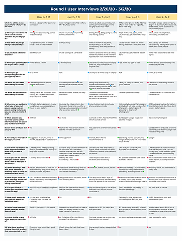

Data Collected from First Round of User Testing.
PERSONAS
My personas were created to cover the high-level needs of a range of users. I created a template for my personas based on criteria on usability.gov and other sources. Each persona was created to navigate through similar paths, but with different needs.
One of the bigger challenges of the project came to me during this phase. I had to remind myself several times that I am a user, but not THE user. I had to rely on the data to move forward rather than on my opinions and experiences as a hiker.

Personas presented in order of importance: Lucy (key persona), Tony, Alex, Bill.


Group and individual empathy mapping.
EMPATHY
& JOURNEY MAPPING
I created empathy maps and journey maps to better understand the path of my users through the app.

Journey map for the key persona, Lucy, on a template I created based on several different models.
Create
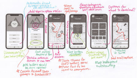
SKETCHES & WIREFRAMING
Because Hiker Help would mostly be used on-the-go with limited access to charging capabilities, it needed to be designed in the most streamlined manner possible. UI considerations needed to include accessibility features and also minimally designed and easily understood emergency prompts and screens. These high-level considerations helped shape my initial sketches. Once I sketched out my screens, I transferred them to the InVision App to create wireframes.


LO-FI PROTOTYPE
My initial lo-fi prototype concentrated on the path users would take to find a hike and view the hike's information. This prototype was very simple and became a learning experience in understanding usability testing tools as well as an exercise in gathering information on the Hiker Help app.
HI-FI PROTOTYPE
As I continued with my prototype, I switched from InVision Studio to Framer, and then to Adobe XD in search of the best tool set. My current iteration of the hi-fi prototype shown below was created from scratch in XD. I chose not to use pre-made kits or templates so that I would have full control over my designs.

Evaluate & Iterate
USABILITY TESTING & ANALYSIS
For my first round of usability testing I kept my scenario and tasks simple. I used the application Validately (now UserZoom) to perform 5 unmoderated tests, and 4 moderated tests. I noted the pain points and frustrations my users encountered and implemented changes to my lo-fi prototype.
My second round of usability testing included 11 moderated tests of my hi-fi prototype, which were also conducted on Validately. Because my testing was task-based I ended up with a lot of usable quantitative data that I could analyze. I looked at task success rates and abandonment rates for each task and analyzed the time it took for users to complete each task. I also added behavioral observations and noted anything the users said. At the end of the usability tests I also set up a questionnaire with several questions on a Likert scale so I could statistically measure how people felt about the app.
EXAMPLE SCREENS FROM HI-FI PROTOTYPE
 Log in page offering 3 different log in methods |  Home landing page which directs users to one of 3 paths |  The profile page that contains the user's personal data and statistics |
|---|---|---|
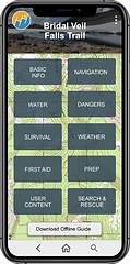
 Hike selection filters that allow the user to tailor their nearby hike results to their needs |  This page allows users to swipe through nearby hikes |  The main info page of a selected hike serves as a dashboard for all of the information available on the chosen hike |
 An example info page, this one covering plants and animals, that can be accessed from the main info page |  Another example of the type of visuals that can be seen in category info pages |  A map with waypoints is one of the most requested features of the app |
 A color-coded list of the user's saved hikes shows previous hikes and alerts users if a hike is missing the most recent update. | 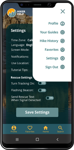 The pop-out menu directs users to key areas of the site, their settings and allows the user to sign out of the app |  The settings page allows users to easily tailor the app to their needs |
KEY ITERATIONS
Main Info Page for Hikes
Through several sorting exercises and user feedback I was able to organize information into the most intuitive and expected categories. I removed the map background and replaced it with a photograph with a dark gray overlay to increase contrast.


Navigation
With feedback showing frustrations surrounding the navigation of the prototype, more features were added to make things a little easier. I added a bottom navigation bar, and a button that links back to the main hike info page from each of the child pages.

Search
To further help with navigation I added a search feature. Accessible from the bottom menu, this search bar searches all content of the app. In future iterations it will break information down by category to help find the correct page faster.
Visual Design
DESIGN / UI
Some of the main considerations in design:
-
Keep the battery use to a minimum- use dark screens to extend battery life on devices with OLED screens.
-
Use calming colors as the app may be used in emergencies.
-
Make text and icons large and easily read as the app may be used in bright sun and in emergencies.
-
Use gender neutral colors, green and blues to mimic nature.
-
Save the use of reds/oranges for emergency features.
-
Continually check for accessibility ratings across all design elements.
-
Make the pop-out menu high contrast to the main background.

LOGO
As you can see, I had a lot of ideas on what to include in the logo! I decided to go with the current logo for a couple reasons. It has two joined "H" forms which represent the app name. The letters form a staircase which is a helpful tool when ascending. The sunset is reminiscent of a good time in the outdoors. The inclined slope represents a challenge to a hiker.

PHOTOGRAPHY
All nature photographs in the app were taken by me on my hikes and adventures. The majority of photographs used in the app were taken during hikes, and where possible I used accurate trail names and stats. Persona images were sourced from Pexels.com.

Looking Forward
NEXT STEPS
Below you can see two features which I plan to add to the current prototype: A tooltips feature that helps a user initially learn to navigate the app, and a current hike mode that allows a user to quickly access their current hike from the home screen.
Beyond that, two of the main features I would like to integrate are social networking and ways to connect with other hikers to hike together.
I also plan to enhance the current features to expand on their value and streamline their design. One example of this is the map. I would like to integrate user photos into waypoints along the trail so hikers can zoom in on the trail, tap a camera icon and see photos of that location.

TOOLTIPS
Tooltips will provide helpful information as users learn to use the app. Once users are comfortable using the app there is an on/off toggle for tooltips in the settings section so that users can have a cleaner app experience.

CURRENT HIKE MODE
Current Hike mode will allow hikers to select "Start Hike" at the beginning of their hike which will make their current hike info page default to their Hiker Help homepage. This will allow users to easily access their information as they are hiking.
CONCLUSION
Whew! That was a lot of info.
I'm very proud of my work on this project. That being said, I have half a notebook full of notes on how to improve this project and the next! For every step of the process that I completed for this project, I performed a retrospective to identify issues, improve my performance and improve the quality of my results. I plan to go back through my project and slowly work to bring this concept up to it's full potential using all of the skills I have learned, and all of the new skills I am acquiring on a daily basis.